

Web design for B2B distributors: what works and what doesn't
If you sell to other businesses, your website is likely not a daily priority. Your focus is elsewhere: acquiring new clients, managing suppliers, moving products, fulfilling deliveries, and retaining existing customers.
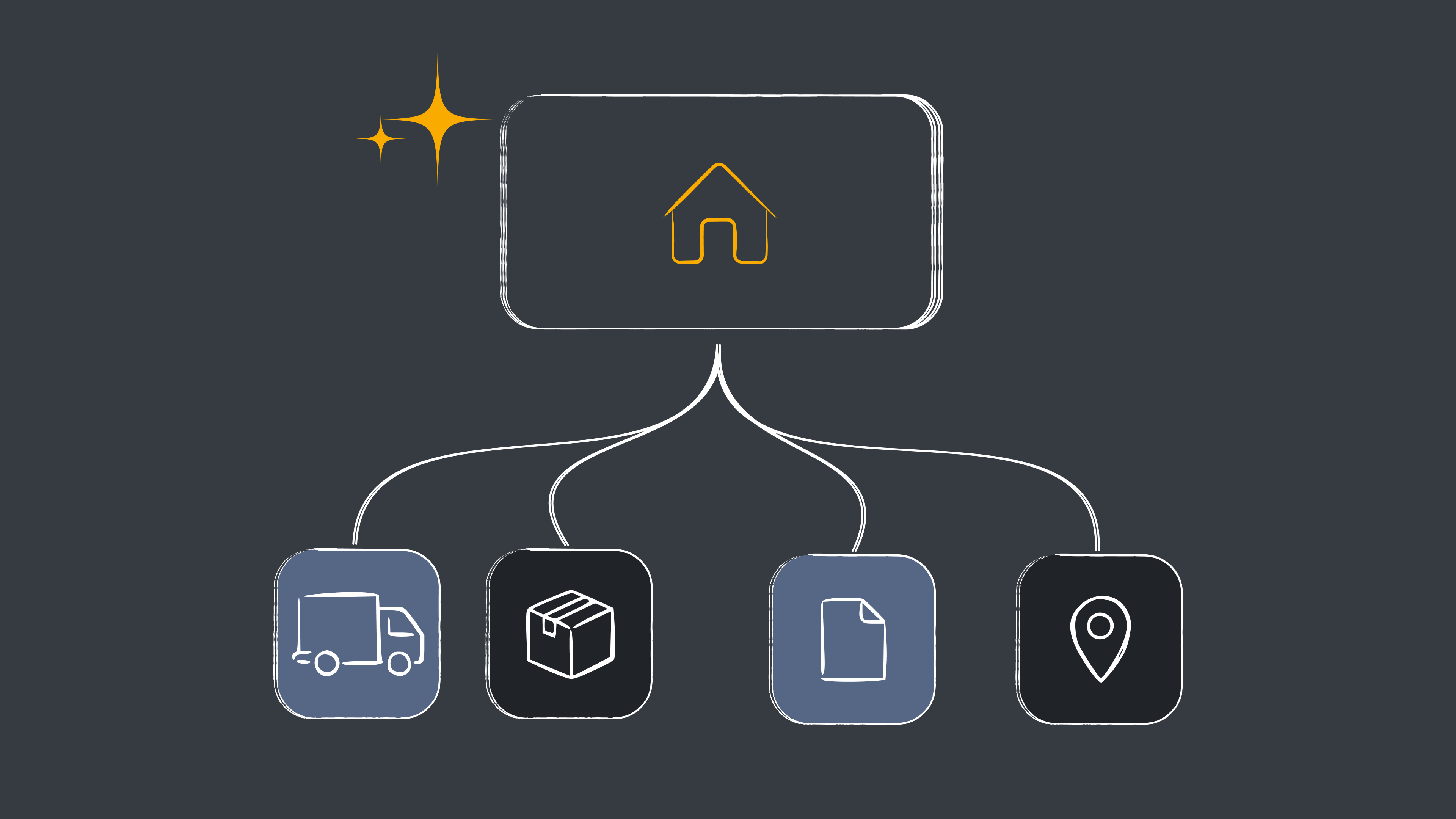
The problem arises when the company grows and the website is left behind. Perhaps it started as a basic catalog. Maybe someone on the team built it years ago. Perhaps a freelancer was hired to get it done quickly and it was never touched again. Meanwhile, the business has changed: new product lines or services have emerged, operational capacity has increased, new clients have arrived, and the sales team has started receiving inquiries that the website could be handling on its own.
The result is usually a website that no longer represents the business you are today. In B2B, that is not just an aesthetic problem: a good website for a distributor must clearly explain what you sell, who it is for, where you operate, and why a company should choose you, in addition to making it easy for a potential client to find you on Google and reach your sales team with enough information to make the first conversation meaningful.
What a B2B distributor's website should have
There is no universal structure, but there are elements that almost every B2B distribution website needs.
A dedicated page for each business line. One of the most common mistakes is trying to explain everything on a single "Services" or "Products" page. If you distribute different categories, serve different sectors, or have multiple business units, each one should have its own page, with its own messaging and its own opportunity to rank on Google for specific searches.
A catalog that helps sell, not just display products. Potential clients need to quickly find what you offer, which industries you serve, which brands you distribute, where you operate, and what volumes you handle. It is not always necessary to show prices (in many B2B models, it simply doesn't make sense), but the website must answer the questions that usually come up before reaching out to sales.
A form designed for selling, not just for contact. "Name, email, and message" works for almost anything, but not necessarily for a B2B company. You don't need a 15-field form: it is enough to ask for the minimum information (what they need, what industry they work in, what volume they handle) so your sales team understands if the inquiry is relevant and arrives better prepared for the first call.
Proof that you can actually deliver on your promises. Saying you are a "leader" or that you offer "excellent solutions" proves nothing. B2B buyers want to know if you have already worked with companies like theirs and if you have the operational capacity to deliver. Clients, success stories, certifications, capacity, coverage areas, response times: the more concrete the data, the better. We saw something similar while working with Bull Transporte, a logistics and transport company with 20 years of experience: the problem wasn't a lack of traffic, but that the site didn't communicate that track record in a way that built real trust.
A structure that can grow with the business. A company that has five product lines today might have ten in two years. A well-structured CMS allows your marketing team to add products, services, or case studies without relying on a developer every time there is something new to publish. If your current site is on a platform that no longer gives you that flexibility, it is worth evaluating a migration without losing your accumulated SEO before deciding whether it is worth rebuilding everything from scratch.
The most common mistakes
Mixing different businesses into a single narrative. When a company grows and adds a new line, it is common to simply add it to the existing site: a new service in the menu, then another, then a product category. Over time, the website ends up trying to talk to everyone at once, and the visitor stops understanding quickly what the company does and which part is relevant to them. If there are distinct businesses or audiences, the site architecture must reflect that.
Maintaining a structure designed for a different stage of the company. A site built when the company had three employees may have been perfect at the time. With thirty employees, new business units, and international clients, that same structure is likely no longer sufficient. It is not a visual problem; it is an architectural one: the website must evolve at the pace of the business.
Depending on a single "Services" page. This is one of the most impactful mistakes for SEO. If you offer ten services and they all appear on a single page, you are depriving each one of the chance to rank for its own search terms. A specific page allows you to better explain the service and build relevant content around the keywords your potential clients actually use. It is the same logic we apply when we work on architecture and SEO optimization for a site: every search intent needs its own page, not a shared one.
A form that doesn't help qualify opportunities. When a form is too generic, the research work ends up falling on the sales team later on, and every back-and-forth adds friction before the first real conversation.
Why a B2B website doesn't work the same way as a SaaS landing page or an online store
It’s tempting to copy design patterns from other sectors, but a B2B distributor has a different purchasing logic. The decision usually doesn't depend on just one person: someone from procurement evaluates suppliers, a technical expert validates the product, and management or finance ends up approving the deal. The website should give each of them enough information to move forward in their own process, without them having to call you just to understand what your company does.
Conversion also isn't usually a direct purchase. There is no shopping cart: the goal is for someone to request a quote, speak with sales, or start a business relationship. And trust there is built with specificity, not adjectives. "Excellent logistics solutions" says nothing. Storage capacity, coverage areas, certifications, or volume managed, however, do.
If you are also deciding which platform to build or rebuild your site on, we compare Webflow and WordPress for businesses with real data, not the same generic comparison as always.
SEO for distributors: every service is a search opportunity
One of the biggest opportunities for a B2B distribution website is transforming the business structure into content structure. If you have different products, services, industries, or coverage areas, each one represents a different search on Google. Instead of a single "Services" page with distribution, fulfillment, storage, and transport all mixed together, each can have its own page, provided there is real content and search intent behind it.
SEO here isn't about stuffing a page with keywords. It's about each page answering a specific need in the best way possible, both for the person searching and for Google.
A real case: Relay Distro
We worked with Relay Distro, a B2B logistics and distribution company based in Houston. When we arrived, the site had a fairly common problem: it had been built by the CEO himself on Squarespace when the company was just starting out. Years later, the business had grown and added a second line of its own, SOON, but both businesses coexisted on the same site without a clear separation of content, messaging, or architecture. For the visitor, it was difficult to understand exactly what each business did. For Google, it was too.
We redesigned and migrated the site to Webflow, separating the two business lines and rebuilding the content architecture from scratch: meta titles and descriptions per page, URL structure, XML sitemap, schema markup, and 301 redirects mapped one by one to avoid losing the SEO equity accumulated during the migration process.
The goal wasn't just a more modern website, but for the site to accurately represent how the business operated, so that both potential clients and Google could understand it. The result was an increase of over 80% in organic sessions after launch, comparing equivalent periods.
Checklist: Is your B2B website ready to generate leads?
Before thinking about a redesign, it's worth asking yourself these questions:
- Does a potential client understand what your company does in under 10 seconds?
- Does every major business line have its own page?
- Can your main products or services be found on Google?
- Do you showcase clients, case studies, or concrete data that build real trust?
- Does your form collect the necessary information for sales to qualify an opportunity?
- Can you add new products or services without relying on a developer?
If several of these answers are "no," the problem probably isn't that your website needs a new design. It probably needs a better architecture.
Your website should support your business, not hold it back
A great website for a B2B distributor doesn't need to impress everyone. It needs to help the right people quickly understand what you do, trust your company, and take the next step.
If your company has grown and added new business lines, but your website hasn't kept up, we can help you identify what's holding your site back and what needs to change. At HeyMate! we design websites for B2B and SaaS companies focusing first on how your customer buys, and second on how it looks.
Publicado:
August 24, 2026
Actualizado:
October 9, 2026

Gonzalo Cáceres Garzón
Co-Founder y Strategy Director